Wednesday, 17 November 2010

KERRANG! - Contents page

Like with NME, the other coverline from the front cover becomes he main focal point; e.g. Marilyn Manson. A lebel gives the name of the artist and the page number of the article.

There is a title to indicate contents, which is winthin the house style as it uses the same font as the front cover. The title also shows the date and the issue number.

Two of the bands featured in the bottom/top coverlines are also featured with an image in the contents page, next to Manson.

The other pages are featured beneath subtitles using the KERRANG! font and contents 'yellow' contents theme (follows house style).

Stories that are featured on the front cover are idictaed by a converse-style sumbol saying 'cover story'. I like this idea, and it emphasizes the articles people bought the magazine for, so they don't have to search.

The captions underneath the bold titles use a lot of personal pronouns e.g. 'you'll be mad to miss this!' The 'mad' and 'miss' is also alliteration. Superlatives like 'finest', 'biggest' and 'newest' are used too. These languages devices are used to effect to draw in the reader, but the vocabulary is simple, which shows that this is produced for a wider demographic of music lovers that don't neccessarily have to be very educated. It shows that this is a mass-marketing magazine for everyone, of any age (teen plus) and ability.

There is also an advertisment for a magazine subcription, which was also on the NME magazine.

Monday, 15 November 2010

KERRANG! - front cover

The masthead creates a house style because of the unique font that it is written in. It is a conventional masthead because it is situated at the top of the magazine.

The top coverline is a puff, because it advertises a celeb article. I like this idea because it looks cool and it makes the magazine seem packed with great info. There is also another puff, which is a bottom coverline. I may use these in my final coursework piece!

The main image dominates the masthead, which shows that KERRANG! is so well known that it can still be recogniseable with half the title obscured. It shows it's for a mass marketed audience. The lighting is quite natural, and Hayley is directly looking at the camera and winking, which appeals to the reader.

The main coverline cuts across the body of the main image. They're dependant upon each other as the article is about Hayley's band Paramore. It also works as a puff because it shows an exclusive artivle. The 'Plus!' caption underneath is a pug as it entices the audience with more reasons to buy/read.

Pugs; The left hand side is dominated with a pug, 'FREE 4 giant posters'. There is also one at the bottom of the page, 'win a trip to Barbados to record an album'. On this pug, the use of different sized fonts emphasize different words.

The other coverline is situated above barcode on the bottom right, this is unconventional. As is the barcode, which is normally in the bottom left. This shows a rock magazine not afraid to bend a few rules.

The date/price is on the barcode, as well as the KERRANG! web address.

Saturday, 13 November 2010

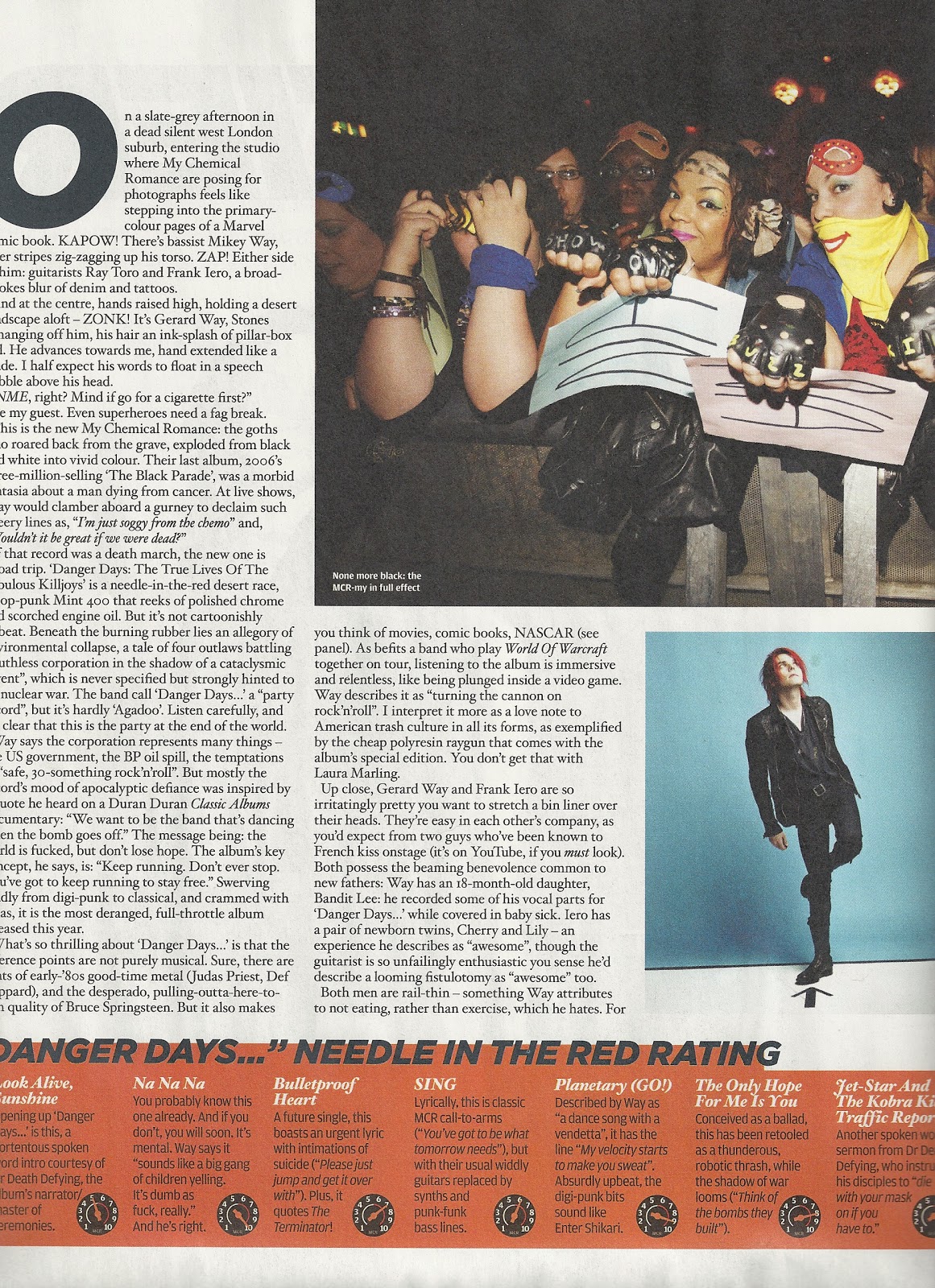
NME - double page spread


The subject of the double page spread is the main coverline and image on the front cover. This is conventional to a magazine, because the main coverline should be the biggest article within the magazine itself. The article itself is about the bands journey from their 'emo' image when they first started to their new image which Gerard Way describes as 'pop-art'.

The writing is all in columns, and there are images to support the text (one of their fans at a gig, and another of the lead singer, as he is the person who is being interviewed). The font is very small.

There are two other features in the two pages; A timeline of the singer's image over the years (which supports overal content of the article) and MCR's new album's rating at the bottom of the page.

The vocabulary is pretty simple, and words that people who are interested in music are used. Expletives are left in, which is typical of the 'rock' image (supporting the content).

The tone of the article is colloquial, which ensures an easy read. This shows that it is aimed at any reading ability who enjoys music.


NME - Contents Page

The contents page for NME magazine, does not seem to follow the house style. E.g. the font is different to the one used on the front cover. However, the same font is used for a caption underneath the masthead 'New Musical Express'. The colour of the font is no longer white either, it is black.

The title is not 'contents' as people might obviously expect a contents page to be labeled, NME have instead decided to use 'Inside This Week', which I think is more appealing to the reader. It's not boring and it creates the image that they are revealing something big that the reader will care about. It's another advertising method which I would like to use in my final coursework piece. The date is also underneath it.

In the bottom left hand corner the name of the photographer is printed.

The main coverline from the front cover isn't the main focus of the contents page, but it is the first picture on the left hand column. The second coverline from the front cover is the main focus of the contents. The 'Suede' comeback article is central to the contents, and uses the biggest picture. I think this is done as a further selling point, as the reader may have missed the coverline on the front cover, but they can see it more clearly in the contents.

The page numbers artistically eat into the images, so they stand out.

The 'plus' column gives extra information about what else is in the magazine. These pages aren't main selling pages, but are what the more loyal readers will be most interested in. It is a small column as they don't 'sell' the magazine.

An advert is used in the bottom right hand corner, which shows a Christmas deal for an NME subscription. It's a seasonal offer, which shows that adverts should be relevant to upcoming events.

Friday, 12 November 2010

NME - front cover

In the top left third of the magazine, we have the Masthead and the date/price. This is conventional to a magazine, as the masthead is usually situated in the top left hand corner.

The main image supports the main coverline, as he is the lead singer of My Chemical Romance. The image uses high key lighting, and he is making eye contact with the reader. His face dominates the page in this midshot, which means the camera was on a slight angle when this picture was taken. He is glaring at the camera which ties in with the main coverline 'We loathe...'.
It is conventional to magazines to have the main image as a mid-shot, and for the main cover line to be supported by it.

The main coverline is at the bottom of the magazine, which is unconventional to magazines. It uses different fotn sizes to capture the audiences attention in an unchronological order. 'My Chemical Romance' is in the largest font, as that is the initial draw to this issue, the smaller fonts give the finer details about the subject of the article inside.

Puffs; the first puff is the 'NME awards tour..' in the top right hand corner. This offers an exclusive you would only find in a music magazine. Another puff is the main coverline, as it offers a celeb article. The artists names on the right hand side is also a puff, as it is celeb related. The other cover line (Suede comeback interview) is also a puff, as it is a celeb exclusive. All the celebrities in music magazines are music artists, therefore when i make my own magazine, I should only include people related to the music industry.

Pug; 'Free Mick Rock Posters' is a pug because they are appealing to the reader.

The font is all the same style, and the majority is white. This shows how NME sticks to a house style.

The barcode, date and price are in the bottom left of the magazine, this is conventional to any magazine.

Music Magazines

For my final coursework task, I will be producing a front page, contents, and a double paged spread of a music magazine.
I have been looking closely at some music mags to see what kinds of conventions they generally tend to have, so that i can use and encorporate them into my coursework. So far i have looked at 3 magazines, NME, Rocksound and Kerrang!. I have scanned into my computer images of the front covers, contents pages and a double-paged spread so that i can analyse them
The results of my analysis will be coming shortly -

watch this space!

Wednesday, 3 November 2010

Preliminary Task and Evaluation

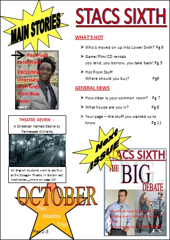
For my Preliminary Task, I have created a front cover and contents page for a school magazine. This is what I came up with;


Evaluation
This magazine is a Niche Market magazine, because only people from STACS sixth form would be interested in buying it. However, it is Mass Marketing in the sense that it is suposed to cater for everybody within the sixth form.

Front Cover;
  • The masthead is conventional as it covers the top of the magazine. It encorporates the name of the 6th form college, meaning it explicity tells us who this magazine is aimed at. The school badge on it's side shows how it's related to STACS but the way I have put it on it's side shows that we're seperate from the rest of the school, and it's just aimed at the 6th form.
  • The main image is a mid shot of a 6th form student, who is going to do an article with Andy from Blue Peter. She is recogniseable, and the eye contact directly addresses the audience. In the mise-en-scene, I have used glasses, a notebook and a pen, as she is my 'journalist'. The costume is casual, because that is how sixth formers dress at STACS. The hair is tied back into a 'sophisticated' bun as she is pretending to be a 'sophisticated' journalist. I have used high key lighting, and casual makeup too.
  •  The main coverline is infront of the picture. It is the same font and colour at the masthead which fits in the house style.  'Past Pupil' is alliteration, which attracts the attention of the reader. This is also a puff as it is an exclusive interview because he is a past pupil.
  • The other coverlines are conventional as they are to the left of the cover. The first coverline is appealing to the audience as it directly concerns them. In the 2nd cover line uses the personal pronoun 'your' which directly addresses the audience, involving them. The last coverline uses alliteration 'terrific theatre trip' which also appeals to the reader.
  • The pug i have used is the 'NEW' in the yellow bubble - this appeals to the reader because it goes against the house style colour scheme, so it stands out, and the reader can see that what they are looking at is brand new.
  • The barcode and date/price are conventional and are situated in the bottom left hand corner.
  • The house style colours are; Red/Black/White, and I have used them throughout. The font style is Calibri.
I used a word processor to complete my preliminary task. The Masthead was made using wordart. I used basic shapes to create the speech bubble, the star, and the text boxes for the writing i have put on the cover. To crop the image I used the picture formatting tool.

Contents;

  • The same font style and colors have been used, because they are the house style of the magazine.
  • The pictures on the left hand side offer the main articles within the magazine, and they tie in with the front cover too and the main coverlines on that.
  • I have used personal pronouns in most page titles, which directly address and engage the reader.
  • I have used a triple 'you lend, you borrow, you take back' which I have used to emphasize a story, and to engage the reader further, as the use of breaking it down into 3 steps makes it sound very easy and do-able.
  • I have shown an example of the next issue, which is about whether or not 6th formers should wear casual or smart attire. This involves everyone in 6th form as the results of this debate could determine what they have to wear, therefore it engages the reader as it affects them.
I also used wors processor to create my contents page. My images were manipulated using the picture formatting tool. I used the basic shapes menu to create the stars and text boxes.I used a word processor to make the mini magazine too, print screened it, and then cropped it to fit in word for my contents page.