Friday, 12 November 2010

Music Magazines

For my final coursework task, I will be producing a front page, contents, and a double paged spread of a music magazine.
I have been looking closely at some music mags to see what kinds of conventions they generally tend to have, so that i can use and encorporate them into my coursework. So far i have looked at 3 magazines, NME, Rocksound and Kerrang!. I have scanned into my computer images of the front covers, contents pages and a double-paged spread so that i can analyse them
The results of my analysis will be coming shortly -

watch this space!

Wednesday, 3 November 2010

Preliminary Task and Evaluation

For my Preliminary Task, I have created a front cover and contents page for a school magazine. This is what I came up with;


Evaluation
This magazine is a Niche Market magazine, because only people from STACS sixth form would be interested in buying it. However, it is Mass Marketing in the sense that it is suposed to cater for everybody within the sixth form.

Front Cover;
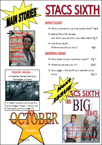
  • The masthead is conventional as it covers the top of the magazine. It encorporates the name of the 6th form college, meaning it explicity tells us who this magazine is aimed at. The school badge on it's side shows how it's related to STACS but the way I have put it on it's side shows that we're seperate from the rest of the school, and it's just aimed at the 6th form.
  • The main image is a mid shot of a 6th form student, who is going to do an article with Andy from Blue Peter. She is recogniseable, and the eye contact directly addresses the audience. In the mise-en-scene, I have used glasses, a notebook and a pen, as she is my 'journalist'. The costume is casual, because that is how sixth formers dress at STACS. The hair is tied back into a 'sophisticated' bun as she is pretending to be a 'sophisticated' journalist. I have used high key lighting, and casual makeup too.
  •  The main coverline is infront of the picture. It is the same font and colour at the masthead which fits in the house style.  'Past Pupil' is alliteration, which attracts the attention of the reader. This is also a puff as it is an exclusive interview because he is a past pupil.
  • The other coverlines are conventional as they are to the left of the cover. The first coverline is appealing to the audience as it directly concerns them. In the 2nd cover line uses the personal pronoun 'your' which directly addresses the audience, involving them. The last coverline uses alliteration 'terrific theatre trip' which also appeals to the reader.
  • The pug i have used is the 'NEW' in the yellow bubble - this appeals to the reader because it goes against the house style colour scheme, so it stands out, and the reader can see that what they are looking at is brand new.
  • The barcode and date/price are conventional and are situated in the bottom left hand corner.
  • The house style colours are; Red/Black/White, and I have used them throughout. The font style is Calibri.
I used a word processor to complete my preliminary task. The Masthead was made using wordart. I used basic shapes to create the speech bubble, the star, and the text boxes for the writing i have put on the cover. To crop the image I used the picture formatting tool.

Contents;

  • The same font style and colors have been used, because they are the house style of the magazine.
  • The pictures on the left hand side offer the main articles within the magazine, and they tie in with the front cover too and the main coverlines on that.
  • I have used personal pronouns in most page titles, which directly address and engage the reader.
  • I have used a triple 'you lend, you borrow, you take back' which I have used to emphasize a story, and to engage the reader further, as the use of breaking it down into 3 steps makes it sound very easy and do-able.
  • I have shown an example of the next issue, which is about whether or not 6th formers should wear casual or smart attire. This involves everyone in 6th form as the results of this debate could determine what they have to wear, therefore it engages the reader as it affects them.
I also used wors processor to create my contents page. My images were manipulated using the picture formatting tool. I used the basic shapes menu to create the stars and text boxes.I used a word processor to make the mini magazine too, print screened it, and then cropped it to fit in word for my contents page.


Saturday, 30 October 2010

Codes and Conventions IV

I have created the front cover of a mass-market music magazine called pitch;

  • The masthead is conventional, as it is situated at the top left hand side. It also creates a house style, with the red and black, lowercase lettering, and the font style.
  • The puffs I have used are in the coverlines. The main coverline offers an exclusive interview with Marilyn Manson, and the cover line below offers the latest images from a Biffy Clyro gig.
  • The pug i have used is a free Marilyn Manson CD, because it fits in with the main image.
  • I have used a three-way symbiotic relationship - the lyric in the main coverline from one of Marilyn Manson's songs and the pug only work because the main image is Marilyn Manson.
  • I have used the colour red throughout as a house style, however I changed to yellow on the 2nd coverline because i wanted it to look different to the main coverline.
  • On the main coverline i have called Marilyn Manson the 'personal jesus'. This appeals to the reader because  he famously covered Depeche Mode's Personal Jesus.
  • The barcode and the date are in the conventional place (the bottom left corner)

Wednesday, 27 October 2010

Codes and Convention III

I have designed a mass-market magazine aimed at proffesional and amateur photographers called 'Photography Now'.
  • The masthead is in the conventional place, which shows that it is a mass-marketed magazine. I have used the same font as the masthead throughout.
  • The main image is a piece of interesting photography, mirroring the target audience. I have also said in a small caption that is the winner of the 2010 competition, which ties in with the 2nd coverline.
  • The main coverline is the most dominant on the page. The use of the imperative 'must' commands the reader.
  • The second coverline is a puff, as it offers a celeb exclusive, with Steven Spielberg judging their competition. The third coverline makes use of alliteration as a language technique to draw in the reader
  • The pug i have used is the competition to win a NIXON camera, which shows the target audience to be people interested in photography.
  • I have the date, price and barcode in the bottom left hand corner because this follows the normal conventions of a magazine, and this magazine is for mass-market consumption.

Monday, 25 October 2010

Codes and Conventions II

Using DTP, I have made another front cover for a magazine called 'Freedom', which targets people interested in Society, Arts, and Culture ('culture vultures'). Therefore it is for a niche audience.

  • The theme behind this magazine is 'Big Brother', in the sense of 'being watched' rather than the TV programme, as the people this magazine targets would recognise how much society is watched today and the article about CCTV would evoke feelings of contempt for higher authority's that try to contain 'free spirits' (AKA, Freedom readers). The theme and the main coverline also tie in with the audience, as it targets people interested in society and culture.
  • The masthead is situated at the bottom of the cover, which goes against the conventions of a magazine. This again shows the target audience, as it's artistic to push boundaries.
  • The 2nd coverline is also a puff, offering an exclusive within the magazine. The language techniques that I have used are; alliteration and the use of the personal pronoun 'your', to engage the reader.
  • I have put in a pug at the bottom of the page entitled 'Win Win Win' advertising a photography competition, which again mirrors the audience that is interested in culture and the arts.
  • The colours and fonts are all within the house style
  • Barcode and date do not go against the conventions of a magazine, and they are situated in the bottom left hand corner

Saturday, 23 October 2010

Codes and Conventions

I have created a front cover for a magazine called FILM_ X
It is a niche market magazine aimed at a cult film audience

  • The Masthead contradicts the normal conventions of a magazine, as it is on the side rather than on the top left of th page. This shows that this magazine is aimed at a niche market.
  • I have used a puff in the middle of the page to show the exclusive interview FILM_ X have in this magazine. I chose to put it straight through the middle of the main image, because this also contradicts the normal conventions of a magazine, as puffs and pugs don't normally cut the main image in half. The puff also shows the main cover line. Another cover line is beneath it, which I have used a triple in, and made it personal to the reader through the repetition of 'your'.
  • The pug at the top of the page offers tickets to a film premiere, which is something you would find mainly in 'film' magazines. I have used a rhetorical question here.
  • I have kept the font style and colour within the House Style; style - Candara, colour - Red, Black and White.
  • The date and price is in the top left hand corner
  • The barcode is in the bottom left hand corner

Thursday, 14 October 2010

Mock-Up of a Contents Page and Front Cover

I have used DTP to create a draft of a contents page for a school magazine.
Here are my results;

This will be really useful when I come to producing my preliminary contents mock up, and then when I complete my final coursework because I know what I can do using DTP and I can see what I can do to improve my presentation etc...

This is a front cover I roughly sketched as a guideline for my preliminary task;