Sunday, 12 December 2010

NOISE draft - Double Page Spread


Like the other 2 posts, I think that my double page spread has the potential to be really authentic looking. It just needs to be altered slightly. I really like the images I have chosen, and I think the red boxes with question and answers from the band look really good and make the actual article itself seem more authentic, so i will definately be keeping those. However, it's not perfect. I would like to change:
  • The font size - after printing it out on paper, I have realised that the font is just too big to look like a real magazine. Again, this is good news for me, because there was more that I wanted to use, but couldn't fit into the article. in addition, the picture captions also need to have a smaller font.
  • I want to try and use more pictures and/or red Q&A boxes.

NOISE draft - Front Cover


I like my draft front cover because I think it had the potential to look really authentic, and I think it looks like it's almost there in terms of looking like a true music magazine that could be sold in a newsagents. I think the content is fine, and doesn't need to be improved, because there is the main cover line, bottom line articles and then the pugs and puffs too (the features of a magazine). However, I am aware that there are areas of my front cover that really need to be worked on, particularly the 'look', I need to make sure that it doesn't look amateur. These are the things I aim to change and improve:
  • Masthead - for some reason, it looks asif the 'O' has dropped, so a simple edit to bring that back up and import it into my front cover will not take me long.
  • The Main Image - I am happy with the image itself, but I would like to cut the models out of the background so that I can have a completely white background, and then have them covering the masthead perhaps, because this will really tie in with the rebelliousness of a rock magazine. I really like that I have already started to show some rebelliousness in the fact that Jake challenges the convention 'look at the camera' pose, with his fingers in his ears. This works particuarly well because Adam is stood next him just looking at the camera, so there is an immediate contrast, which ties in with the bands ethos and the rock magazine rebellious nature.
  • The Puff - 'New!! Album Reviews'. This, i feel, doesn't quite match the style that I have gone for, so I think to improve this I will either cut it out or use an effect to make it look more like it fits in with the rock ethos of the magazine.

Saturday, 11 December 2010

NOISE draft - Contents


Analysis:
I think that this is my strongest feature of my magazine, because it looks the most authentic. However, when it comes to making my actual magazine a few things need to be tweaked. The most minor of these are:
  •  Font size - this needs to be smaller, because I have printed out my contents page and realised that it is actually far too big for a magazine. This is a good thing really, because there were a lot more things i wanted to put up and say on the contents, and this will now give me the opportunity to do so.
  • Grammatical errors - all I need to do there to improve is properly read what I have put and make sure that is it correct. Also, I need to check that what is meant to be bold is bold.
The bigger amendments are;
  • I need to add in more pictures that suit the articles. This will then help me to get better marks because it means i have a greater range of pictures, not just the ones on the double page spread.
  • I also need to add in more articles, because I chose my font size too big which meant I couldn't fit enough on. I may also try to add in an advertisement too for maybe a subscription to NOISE magazine.

House Style

Colour Scheme:
My colour scheme will be Red, Black, White and Orange.
I have decided this through experimentation with my masthead.
I created a black and white masthead, and a red and black masthead, and put them against a picture to see which looked better. From the pictures below I have decided to use the red and black masthead for NOISE magazine.


Cover Lines:
Coverlines will be written in the same font as the masthead. I am planning on using white or red for them. I will see which look better when i contruct my magazine.

Headlines:
Particularly in the contents, my headlines will look the same as the masthead, but with an orange background.

Captions:
Captions will be written using the font; Franklin Gothic Demi, and white/red colour (the opposite of the Cover Line).

Body Text:
Body text will all be in Franklin Gothic Medium font, and white writing.


Friday, 10 December 2010

Sketched ideas for my magazine

Front Cover:
This just gives me an idea of spacing for my front cover, and what I can include.

Contents:
This again, is an idea of spacing for my contents page, and how many photos I'd like to use in it. I have tried to fill the space as much as possible, so I may have to cut some of this out when i actually come to contructing it.

Double Page Spread:

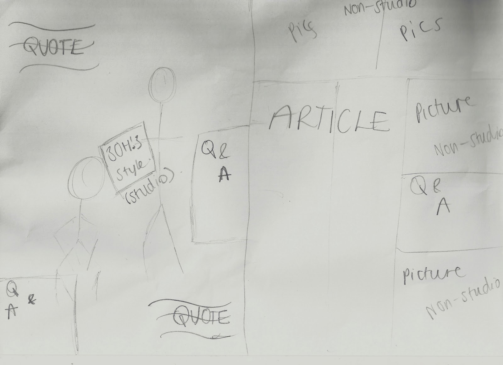
This is the least detailed sketch, because I know this will be the hardest to do. When I construct this, I will need to experiment around more than the front cover and contents, so I have just played around with spacing on this plan, so that I have a rough idea of what I want to achieve.

PHOTOSHOOT

On the 10th December, I organised a photoshoot for the main band of my magazine.

Itinerary

1. Studio shoots for cover
This was shot in my living room, with a white sheet against the wall as a backdrop.
Little to no props were used, because I wanted it to be just them and nothing else. They don't need proof of being in a rock band, because they will be on the cover of NOISE magazine, and as they aren't live gig pictures there's no need for instrumental props. I chose this location because I thought it would be easiest to try and recreate a studio styled picture.

These were the images;


As you can see, I have started to experiment with editing on a couple of the pictures. I think i will use the one with the fingers plugged into the ears as my cover photo, as it will match the ethos of the magazine. The larger images are ones that i feel i could use - with the correct editing etc.

2. Double-page spread shots
For these shots, we used my garden as the backdrop. I had the park as a backup plan incase I wanted more choice. This was the case in the end, so we trekked up to the park and used the benches, swings, roundabout, and trees in general to create some 'DO I GIVE A DAMN' pictures. I chose this location because with it being winter I thought this would create a good backdrop for the band, and with the magazine being a november issue, it would tie into the seasonal aspect of the magazine.


These images are a mix between the serious rock pose, and the more crazy 'yes we don't care if it's childish' poses. I think these will go well with the article I have drafted for my double page spread. I have also edited some of these pictures, just to experiement with how I might adjust them for use in the magzine. The larger images are the ones I think would be best for the magazine, but this is subject to change during the construction.

Costume:

Jake: I chose to have Jake in the superman t-shirt with black skinny jeans because it creates the image of a person who doesn't take himself too seriously, and is influenced by the rock genre. In the outdoor pictures, I chose him to wear that particular coat because the all in black again is associated with the rock genre, but it's not a metal band, they still wear pretty normal clothing for young people and this is reflected in that. I asked him to wear Dunlop trainers because they look good with the image I was trying to create. I also asked him to wear the purple fingerless gloves because this makes him look more like a person that doesn't care about appearance, which is a rock star attitude.

Adam: I chose to have Adam in the dark wash-out top because it suggests that he doesn't care about dressing up. I put this with dark blue skinnys again that are influenced with the rock genre too. In the outdoor pictures he's also wearing a dark coat, which is much lighter material than Jakes. This is because I wanted him to look fashionable in a way that doesn't make it look like he's tried too hard, which would match the bands image of a Blink 182 style 'out for the laughs' guys. He's wearing casual pumps too, which goes well with the rock image I was trying to create.

Props:

I chose to use a guitar as a prop because most Rock uses guitars. However, I chose an acoustic guitar because most rock is played on electric, so it makes sense to smash up the guitar they are less likely to use. I used the swings as a prop because it puts emphasis on the fact that 'Still Nameless' are a band that don't take themselves too seriously.

Influences - Target audience

I have been researching into the rock genre and looking at the conventions of rock magazines. This is an issue of Kerrang! that shows the cockyness of rockers. The fact that the masthead is almost completely submerged shows K! confidence in being recognisable, and the body language of Pete and Patrick from Fall Out Boy show their cocky attitude; like they don't care and this is what they are so deal with it.
I like the main coverline going through the image, and the other coverlines at the bottom. This will be a technique i adopt when i do my magazine.


This is not a rock magazine, it's a 'London-culture' magazine. What i really like about i-D magazine, is that each cover star adopts an 'emoticon' face, asif they're creating their own version of i-D flipped round. I like how this captures the ethos of the magazine. I can use this in NOISE because of the hazard sign I have used as the 'O', and have one actor standing with his hands over his ears. I will try this with my actors and see if this works on a mock cover.