Tuesday, 1 February 2011

NOISE - Final Double Page Spread


The main problem with my draft dps, was that the font was FAR too big, so I made that much smaller and then rearranged the text boxes so they fitted the new font sizes. After I had adsjusted my font, I found that my article was too short, so I also lengthened that. I had more space now on the 2nd page, therefore I could use more images. I manipulated them first using paint.NET, and then inserted them into publisher. I put borders around them too. I used the quote in the middle of the article because this is a convention often used in music magazines, and I think it makes my dps look more authentic. The additional space also allowed me to add in more of the text boxes containing questions answered by Adam and Jake, which again just adds to the authenticity of the magazine. Overall I am pretty happy with my dps.

Monday, 31 January 2011

NOISE - Final Front Cover


The first thing I did to my front cover was cut out the main image from the bad background I had before. I did this using paint.NET and saving it as a PNG file. I then inserted it into my publisher file and decided the white background was boring, so I changed it to a really dark grey because black was too dense. I also re-did my masthead because it was slightly wonky, so I straightened it out and made a red one for my front cover. I gave it a white border too, and made it smaller than my draft, because I felt it was too big. I also made Jake and Adam cover the masthead, which follows the conventions of a Rock magazine like K! or Rock Sound. I also edited the 'posters' and cut out the backgrounds on 'Travey' and 'Catch Fire'. I think it looks much better now. I completely scrapped the puff because it looked un-realistic and too overcrowded with one.

Sunday, 30 January 2011

NOISE - Final Contents


The main thing I needed to change on my contents was the font size. Before I did anything, I changed my font size and made sure everything fitted. I then realised I had plenty of space to add in another column, (which I couldn't fit in on my draft). I then added in the NOISE quiz page, and a competition, which I will put at the puff on the front cover. I also had space for images, so I manipulated the picture of 'Dave' on paint.NET and removed him from the background. I used him as the artist for the NOISE quiz. I still had space, which meant I could also do an advertisement, which I wanted to do first time round but had no space. Looking through magazines like Kerrang! and Rock Sound, they have advertisements for the monthly prescriptions, so I thought it would be fitting to do one of these too. I also changed the masthead, because it was slightly out of proportion on both my Front Cover and my Contents, so I have re-done that and inserted it back onto my contents. Kerrang! has mainly inspired this contents page, with the large image at the top and the columns at the bottom, so I know it is definately of the Rock genre, and therefore aimed at Rock listening people. I am very happy with my contents!

Friday, 28 January 2011

Image manipulation

I've been editing the other pictures that I will be using in the magazine. This image is of one of the 'posters' on the front, and I have removed the background on it because it looks un-realistic.
This is my image;
This will look much better on my front cover as one of the posters.
This is another image I have cut away from the background. I will be using this on my contents page.

Monday, 24 January 2011

Image Editing cont...

After cutting out and feathering my original front cover image, I decided to paste it into my front cover to see what it would look like.
This is what I first did;

I thought the white space at the back looked rubbish, so I made the picture bigger and had it covering the masthead more, just to see what it looked like.
This is what that looked like;

Thursday, 20 January 2011

Image Editing

FRONT COVER IMAGE:
I wanted to cut out my models and remove them from their background completely. I have now done this using paint.NET.
This is the image before I had feathered the edges.


This is the feathered image:


Questionnaire after my draft

I have decided to ask 10 people to fill out a questionnaire about my drafted magazine.
This is my questionnaire;
My results:

1. Do you read magazines?50% do read magaizne, 50% don't.

2. Do you think this looks like a real magazine?
100% said yes.
Why?
Everyone said it was realistic, other comments were;
It resembles most magazines,
The style,
Pictures look authentic
Design
Layout
Fonts
It's like K! which is also a music magazine,
language/tone of the article
Front Cover

3. What do you like most about it?
the answers I got are;
Querky captions
photography (looks proffesional)
'Fantastic' designs
Layout
Font
Front cover and Contents are really realistic,
Still Nameless sound like they could be a real band
The article.

4. What do you dislike about it?
1 person said 'nothing', however, the constructive criticisms are;
models,
price
the star offering album reviews
font size (too big)
Front cover is too packed.

5. What do you think I need to change?
3 people said they wouldn't change anything, however, the several others said that they would choose;
font size
price
front cover - uncrowd it
More Jessie Mac!
The star.

Overall I think this has been a really useful questionnaire, and I know what I want to change now to make it look more realistic.  I will definately be shrinking my font size, removing/changing the star so it fits in more with my magazine. I won't be changing the price because I have put research into the price of monthly magazine and I know mine is roughly correct.

Friday, 14 January 2011

Software

To contruct my draft magazine, I have used publisher and image editing software. I chose publisher because it is easy to layer my work and also to get a variety of shapes and text boxes etc to easily contruct my magazine. 

Front Cover:
Before I started to contruct this, I made sure I had a rough sketched plan of how I vaguely wanted it to look. Then I edited the main image and altered the lighting and contrast to get it looking how i wanted it to using the image manipulation programme. After I hadf done this I pasted it into publisher and then used it as a starting post to create my front cover, so everything would either fit on it or around it. The good thing about publisher is, you don't have to just work on the document, there is space around it; which is where i contructed the 3 posters. I imported the pictures (having already edited and cropped them) and then gave them a thick border. I think fiddled around with the composition and finally came up with the idea of having the largest in the middle on a slight slant, in the forground, with the other two behind it. I then grouped these images together and then put them on top of the main image. Publisher was also useful in creating the coverlines. The main coverline was created by just using a text box and was really simple and quick to do. the use of 'print preview' is also really useful, because I could keep checking it to see how authentic my magazine was looking without the construction lines. I had already created the masthead in word, so I just had to import it from file into publisher.

Contents:
I made a sketched draft of a contents on A4 paper before I started to make an electronic draft. I then used publisher to make my draft contents. I used an image manipulater to edit the main image and the picture of the 'editor' before importing them into publisher. I then used shapes and text boxes to make the blocks of colour and writing. I used the columns from K! magazine as inspiration for my contents. To do this, I used 3 text boxes and made the lines black on the left hand side of each. I did the headers by changing the font and then highlighting them in an orange colour. To get the masthead onto the contents, i just imported the image I had saved from the word document I created it in.

Double Page Spread:
After I had drew up a sketched draft on A4 paper, I used publisher to create m double page spread. Firstly I worked on the picture page, with the full sized image of Jake and Adam. I changed the lighting on it at first with an image manipulater, and them imported it into publisher. I then used text boxes to do the text around the picture, and just changed fonts, colours and font sizes. On the second page, I cropped and changed the pictures to how i wanted them, and then imported them into publisher. Before I put them into the article, I typed up the article using 3 text boxes to create the column effect again. I then put the images around the text. I made the red border by formatting the picture and making the line thicker and changing it to red.  To make the red Q&A boxes, I just used a text box and changed the colour to red.

Thursday, 13 January 2011

Influences - my draft magazine

Front Cover:

On my front cover I was influenced by both Kerrang and I.D magazine. Kerrang influenced the bottom line articles, the main cover line and the posters in the bottom right. I chose to use these because I think they look really good on the cover of a magazine, particularly a rock mag. Take the posters for example, a lot of rock magazine readers buy magazine for the posters, so to advertise them on the front cover seemed clever to me.  I.D magazine influenced my masthead and main image. I made the 'O' a hazard sign, which then influenced the main picture as Jake has his fingers in his ears. I.D magazine has a 'wink' as the masthead, and each person on the cover pulls their own version of it.

Contents:

My contents page is very much influenced by Kerrang Magazine. I really like how they have another feature as the main image, and then the rest of the contents listed below. I also used the idea of the editors note on the contents page too, with the picture and a colloquial paragraph accompanying it. Like most magazine, music or non-music, Kerrang divides its contents into sections that the readers can dip in and out of. I have also done this, and highlighted them in orange, and used the same font as the masthead. I also gave extra info on some headlines, which create humour and appeal to the reader.

Double-page spread:

My article is influenced by K! magazine too, because it follows a similar structure to a Paramore article I researched, which had a full page picture, additional comment boxes, and the article on the page next to it. I was also influenced by the language of the article, that set the scene in the opening paragraph, and told readers what the band was all about e.g. the music.The images are also like ones in K!, because they show images of the band offstage, which could show the casualness of the interview and how it is revealing personal stuff about the band.

Wednesday, 12 January 2011

Language and Scripting

In my double paged spread I had to make sure that my language and register was right. I needed it to be like a Kerrang or Rock Sound style article, like this one about Blink 182 from Kerrang.
The register is conversational and it uses words related to music and more importantly rock music. I wanted to copy this informal register and incorporate it into my double page spread. I made sure that my quotes made Still Nameless sounded like a decent band that are in the music business for the music, and that they sounded like a fun band. I used info like 'Top 5 Bands' to encorporate the bands humour, '..and that really handsome band, Still Nameless?' I also did picture captions which mock them, to show that they don't take themselves seriously, and also to match the rebellious rock genre.

Sunday, 12 December 2010

NOISE draft - Double Page Spread


Like the other 2 posts, I think that my double page spread has the potential to be really authentic looking. It just needs to be altered slightly. I really like the images I have chosen, and I think the red boxes with question and answers from the band look really good and make the actual article itself seem more authentic, so i will definately be keeping those. However, it's not perfect. I would like to change:
  • The font size - after printing it out on paper, I have realised that the font is just too big to look like a real magazine. Again, this is good news for me, because there was more that I wanted to use, but couldn't fit into the article. in addition, the picture captions also need to have a smaller font.
  • I want to try and use more pictures and/or red Q&A boxes.

NOISE draft - Front Cover


I like my draft front cover because I think it had the potential to look really authentic, and I think it looks like it's almost there in terms of looking like a true music magazine that could be sold in a newsagents. I think the content is fine, and doesn't need to be improved, because there is the main cover line, bottom line articles and then the pugs and puffs too (the features of a magazine). However, I am aware that there are areas of my front cover that really need to be worked on, particularly the 'look', I need to make sure that it doesn't look amateur. These are the things I aim to change and improve:
  • Masthead - for some reason, it looks asif the 'O' has dropped, so a simple edit to bring that back up and import it into my front cover will not take me long.
  • The Main Image - I am happy with the image itself, but I would like to cut the models out of the background so that I can have a completely white background, and then have them covering the masthead perhaps, because this will really tie in with the rebelliousness of a rock magazine. I really like that I have already started to show some rebelliousness in the fact that Jake challenges the convention 'look at the camera' pose, with his fingers in his ears. This works particuarly well because Adam is stood next him just looking at the camera, so there is an immediate contrast, which ties in with the bands ethos and the rock magazine rebellious nature.
  • The Puff - 'New!! Album Reviews'. This, i feel, doesn't quite match the style that I have gone for, so I think to improve this I will either cut it out or use an effect to make it look more like it fits in with the rock ethos of the magazine.

Saturday, 11 December 2010

NOISE draft - Contents


Analysis:
I think that this is my strongest feature of my magazine, because it looks the most authentic. However, when it comes to making my actual magazine a few things need to be tweaked. The most minor of these are:
  •  Font size - this needs to be smaller, because I have printed out my contents page and realised that it is actually far too big for a magazine. This is a good thing really, because there were a lot more things i wanted to put up and say on the contents, and this will now give me the opportunity to do so.
  • Grammatical errors - all I need to do there to improve is properly read what I have put and make sure that is it correct. Also, I need to check that what is meant to be bold is bold.
The bigger amendments are;
  • I need to add in more pictures that suit the articles. This will then help me to get better marks because it means i have a greater range of pictures, not just the ones on the double page spread.
  • I also need to add in more articles, because I chose my font size too big which meant I couldn't fit enough on. I may also try to add in an advertisement too for maybe a subscription to NOISE magazine.

House Style

Colour Scheme:
My colour scheme will be Red, Black, White and Orange.
I have decided this through experimentation with my masthead.
I created a black and white masthead, and a red and black masthead, and put them against a picture to see which looked better. From the pictures below I have decided to use the red and black masthead for NOISE magazine.


Cover Lines:
Coverlines will be written in the same font as the masthead. I am planning on using white or red for them. I will see which look better when i contruct my magazine.

Headlines:
Particularly in the contents, my headlines will look the same as the masthead, but with an orange background.

Captions:
Captions will be written using the font; Franklin Gothic Demi, and white/red colour (the opposite of the Cover Line).

Body Text:
Body text will all be in Franklin Gothic Medium font, and white writing.


Friday, 10 December 2010

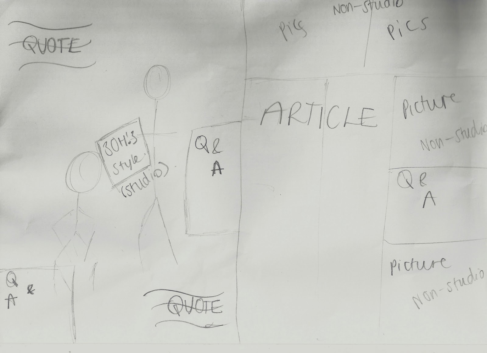
Sketched ideas for my magazine

Front Cover:
This just gives me an idea of spacing for my front cover, and what I can include.

Contents:
This again, is an idea of spacing for my contents page, and how many photos I'd like to use in it. I have tried to fill the space as much as possible, so I may have to cut some of this out when i actually come to contructing it.

Double Page Spread:

This is the least detailed sketch, because I know this will be the hardest to do. When I construct this, I will need to experiment around more than the front cover and contents, so I have just played around with spacing on this plan, so that I have a rough idea of what I want to achieve.

PHOTOSHOOT

On the 10th December, I organised a photoshoot for the main band of my magazine.

Itinerary

1. Studio shoots for cover
This was shot in my living room, with a white sheet against the wall as a backdrop.
Little to no props were used, because I wanted it to be just them and nothing else. They don't need proof of being in a rock band, because they will be on the cover of NOISE magazine, and as they aren't live gig pictures there's no need for instrumental props. I chose this location because I thought it would be easiest to try and recreate a studio styled picture.

These were the images;


As you can see, I have started to experiment with editing on a couple of the pictures. I think i will use the one with the fingers plugged into the ears as my cover photo, as it will match the ethos of the magazine. The larger images are ones that i feel i could use - with the correct editing etc.

2. Double-page spread shots
For these shots, we used my garden as the backdrop. I had the park as a backup plan incase I wanted more choice. This was the case in the end, so we trekked up to the park and used the benches, swings, roundabout, and trees in general to create some 'DO I GIVE A DAMN' pictures. I chose this location because with it being winter I thought this would create a good backdrop for the band, and with the magazine being a november issue, it would tie into the seasonal aspect of the magazine.


These images are a mix between the serious rock pose, and the more crazy 'yes we don't care if it's childish' poses. I think these will go well with the article I have drafted for my double page spread. I have also edited some of these pictures, just to experiement with how I might adjust them for use in the magzine. The larger images are the ones I think would be best for the magazine, but this is subject to change during the construction.

Costume:

Jake: I chose to have Jake in the superman t-shirt with black skinny jeans because it creates the image of a person who doesn't take himself too seriously, and is influenced by the rock genre. In the outdoor pictures, I chose him to wear that particular coat because the all in black again is associated with the rock genre, but it's not a metal band, they still wear pretty normal clothing for young people and this is reflected in that. I asked him to wear Dunlop trainers because they look good with the image I was trying to create. I also asked him to wear the purple fingerless gloves because this makes him look more like a person that doesn't care about appearance, which is a rock star attitude.

Adam: I chose to have Adam in the dark wash-out top because it suggests that he doesn't care about dressing up. I put this with dark blue skinnys again that are influenced with the rock genre too. In the outdoor pictures he's also wearing a dark coat, which is much lighter material than Jakes. This is because I wanted him to look fashionable in a way that doesn't make it look like he's tried too hard, which would match the bands image of a Blink 182 style 'out for the laughs' guys. He's wearing casual pumps too, which goes well with the rock image I was trying to create.

Props:

I chose to use a guitar as a prop because most Rock uses guitars. However, I chose an acoustic guitar because most rock is played on electric, so it makes sense to smash up the guitar they are less likely to use. I used the swings as a prop because it puts emphasis on the fact that 'Still Nameless' are a band that don't take themselves too seriously.

Influences - Target audience

I have been researching into the rock genre and looking at the conventions of rock magazines. This is an issue of Kerrang! that shows the cockyness of rockers. The fact that the masthead is almost completely submerged shows K! confidence in being recognisable, and the body language of Pete and Patrick from Fall Out Boy show their cocky attitude; like they don't care and this is what they are so deal with it.
I like the main coverline going through the image, and the other coverlines at the bottom. This will be a technique i adopt when i do my magazine.


This is not a rock magazine, it's a 'London-culture' magazine. What i really like about i-D magazine, is that each cover star adopts an 'emoticon' face, asif they're creating their own version of i-D flipped round. I like how this captures the ethos of the magazine. I can use this in NOISE because of the hazard sign I have used as the 'O', and have one actor standing with his hands over his ears. I will try this with my actors and see if this works on a mock cover.

Wednesday, 8 December 2010

Publication Plan

Before I start to draft my final magazine, I have put together this publication plan, which will give me some guidelines and somewhere to start for my final piece.

Masthead: I have come up with 4 different masthead styles for 'NOISE', using the same hazard-sign image for the 'O'.


 Any of these would look really good on my magazine, but I think the best would be the two in the right-hand column. I will experiment with these, and see which looks best on my magazine cover.

Positioning of the statement/selling line: I really like selling lines that cut through the main image. I think these look rebellious and that fits the stereotype of a rock magazine. In NOISE mag, the selling line will cut across the main image.

Frequency of Publication: Looking at other rock magazines, there is no 'trend' as to when they are published. E.g. K! is published every wednesday but Rock Sound is published monthly. NOISE mag will be published monthly, because I think monthly magazines have more flexibility in what they publish, because there is so much to put in. Whereas this would be harder to achieve in a weekly magazine.

Price: Most monthly magazines are priced inbetween £3.50-£4.50. NOISE mag will cost £4.00, purely because that is how they average out.

Distribution: http://www.bauermedia.co.uk/ this is the link to the website that distributes over 80 'influential media brands' ranging from K! magazine to FHM. They also own the 'Big City Network' which is a group of 20 local radio stations.

Rationale: My magazine will offer Rock music fans, news, interviews, exclusives, and competitions. It will dig into the lives of their favourite rock artists to give them an insight of what they do on tour or just at home in their 'free-time'. The competitions will give them the chance to meet their favourite bands, travel maybe, or win free tickets to gigs, free merchandise etc. It will also be a place where they can order band merchandise safely, and without the risk of being conned. It will have tour dates, gig reviews and fan mail pages so that it is a fully interactive magazine, where the consumers can have their say in what goes in.

Style: My target audience will be rock music fans, therefore my magazine will be quite rebellious and suit the rock genre.

Regular Content: The regular content in NOISE magazine will be;
The 'mail' page - where the consumers can send in their pictures/thoughts/messages etc
Tour info - There will always be a page dedicated to listing the upcoming tours of the rock bands the consumers will love
Artist Features - there will always be an artist feature/interview because those are the articles that consumers prefer.
Posters- in every issue, there will be at least A4 posters of bands that my target audience will love.

Feature content: The feature content in NOISE magazine will be;
Unmissable competitions - the chance to meet a band you love, VIP tickets to gigs etc...
Giant posters
Exclusive interviews that reveal things fans would love to hear but would never have known.

Thursday, 2 December 2010

Questionnaire Results and Analysis

I handed out the questionnaire (as shown in my previous post) to 10 randomly selected people. These are the results I have found;

Do you read music magazines?
80% said Yes
20% said No
This tells me that the majority of my results are from music mag readers, and are therefore quite valid.

If yes, when do you buy music magazines?
20% said Weekly
20% said Fortnightly
30% said Monthly
0% said Annually
30% said Other (2 do not buy magazines, and one person said they do whenever Paramore is on the cover)

From these results, I can conclude that the release of my magazine can be very flexible. It will probably be a monthly/weekly magazine, as they are most popular and what I would have chosen too.

Do you think 'NOISE' is a good name for a Rock Magazine? Why?
80% said Yes - It's catchy/appropriate/original/relates to genre/ironic, in the way it 'mocks' what others could think about rock music.

20% said No - it gives bad connotations to music.

The fact that the majority liked the name tells me it is a good name for a rock magazine, and I am definitely keeping it. I disagree with the 20% that said no, as i don't think it gives a bad connotation at all, but the majority wins, so NOISE mag it is.

What images would you expect to see on the Front Cover?
80% said Band/Artist studio shoots
10% said Gig photos
10% said Other - awards pictures

The prefered result was clearly the Band/Artist studio shoots, which is what i was hoping to do anyway. 'Awards Pictures' was a bit too vague for me, and I don't fully understand the idea behind it. I will use a studio shoot for my front cover because of this result.

What images would you expect to see inside the magazine?
0% said Studio
10% said Gig
90% said Mixture

From this landslide win, I can concur that a mixture of photo-styles should be used inside my magazine.

What colours would you associate with a Rock Magazine? Why?
I gave no options for this, so people just came up with their own colours accompanied with their own reasons.

The people said;
Black: 9 votes
Red: 7 votes
White: 2 votes
Orange: 1 vote
Yellow: 1 vote

Black and Red are by far the most popular, and I am really happy with this result, because in my mind I was already considering a black/red/white theme to my magazine. The reasons behind black and red were mainly things like 'Rockers wear a lot of black and red'. However, some really good explanations were things like 'Red is a loud clashing colour, which matches the ethos of the magazine and would look really good with Black'.

What articles would you prefer to read?
(more than one box can be ticked)
Reviews : 4 votes
Artist features/Interviews: 10 votes
Q & A's: 4 votes
Music News: 4 votes
Non-Music News: 0 votes

It is clear from the results that everyone prefers to read music related articles in music magazines. However, as i only have one double-page spread, I think i will do an Artist feature/interview because everyone who did my questionnaire said that they would prefer to read this style of article.